This article from 2021 is the fourth out of four that I wrote on this topic over ten years. For the other three, see the links below.
How consistently does Adobe design the interfaces of its programs? Not very consistently: back in 2017, the last time I checked, even a basic UI element like the Save dialog didn’t look the same across all of Adobe’s programs on MacOS. No two dialogs were identical in every property — which is actually quite an achievement. And only one of them stuck to the MacOS system standards.
Four years later: the apps come in new versions, and MacOS has also significantly redesigned its interface with Big Sur. What’s changed? We’re looking at a slightly different selection of programs this time, but the heavyweights of the CC Suite — Photoshop, Illustrator, and InDesign — are back in the mix, along with an interesting newcomer.
See for yourself. Spoiler: it doesn’t get better.
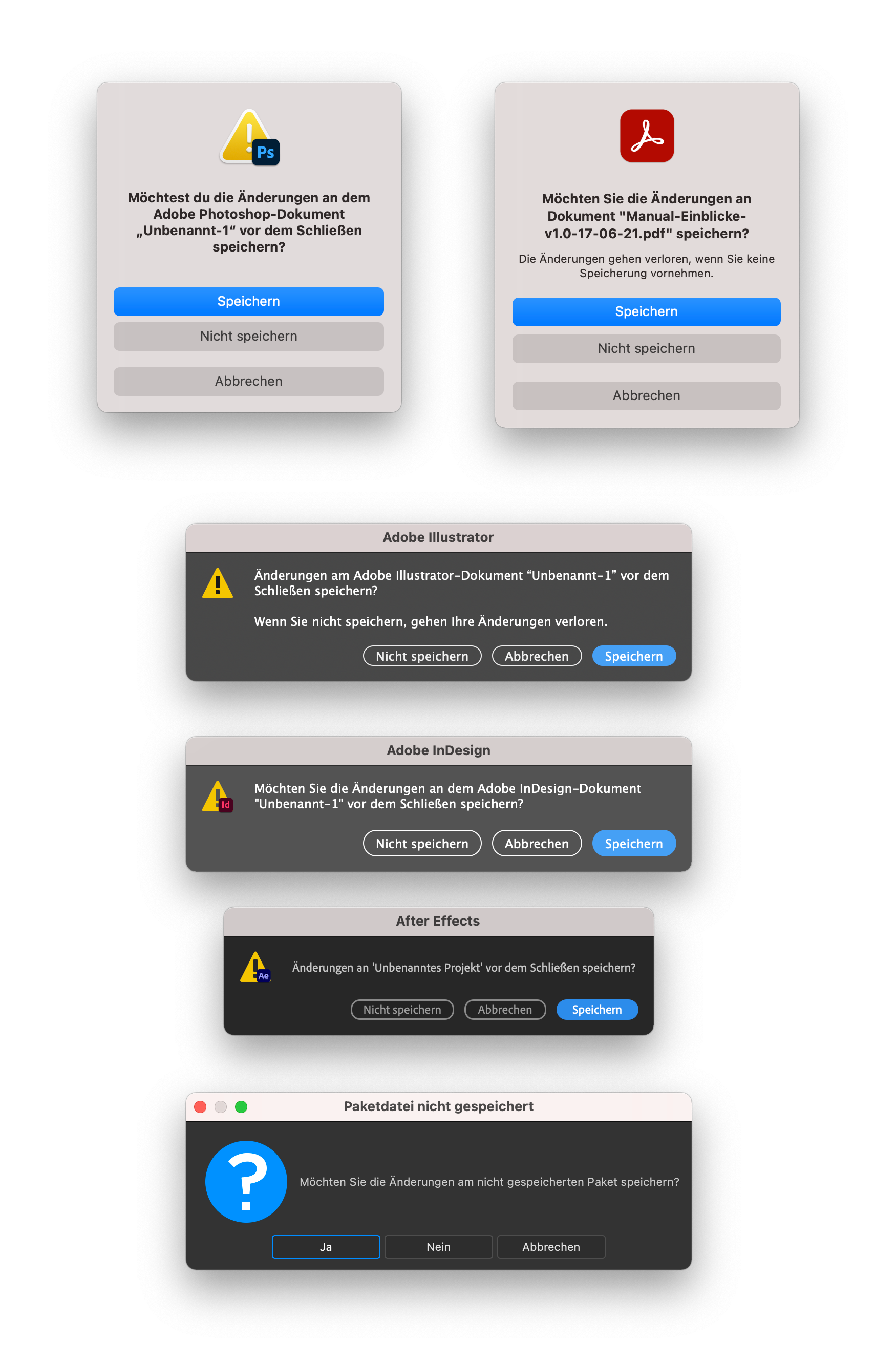
A few observations:
No app uses the dialog that Apple provides and uses in its own apps.
Photoshop and Acrobat use the alert modal that Apple introduced with Big Sur. That’s something, at least, because it means the buttons look like Big Sur buttons rather than badly imitated MacOS buttons. The new Apple dialog has its own issues, but the apps would automatically pick up improvements with system updates. So everything’s fine otherwise? Of course not: even the two dialogs from Photoshop and Acrobat don’t do everything the same way. It’s amazing what differs between them: large app icon vs. warning icon with overlay, informal vs. formal address, correct vs. incorrect quotation marks, extra text or no extra text.
The dialogs in Illustrator and InDesign haven’t changed since last time (that’s four years ago now), except that the window titles are now the same shade of gray, because they inherit it from the system. The buttons are still poorly hand-drawn — and each in its own different way.
After Effects has colored the default button blue. The secondary buttons still don’t look like any of the others. Recoloring one button was apparently change enough.
In Adobe XD there’s no Save dialog at all anymore. Every document is constantly saved to the cloud, including new ones. On the one hand, that’s good: in principle, data can no longer be lost. On the other hand, it’s a shame, because back in 2017, XD was the only app that followed Apple’s guidelines, right down to the ‘Save’ label on the default button.
And then there’s Substance 3D, Adobe’s latest acquisition. Once you look at its dialog design, all the others — with their flaws — don’t look so bad anymore. Buttons labeled Yes, No, Cancel, and the giant question-mark icon — wow.

Save, HIG style

Here’s Apple’s dialog — the one Adobe doesn’t adhere to. You could debate whether this dialog is overly complex, since it already folds in the next step — but if Adobe were to adopt it, they’d at least be free of any consistency problems and ugly imitation interface elements.
Et tu, Microsoft?
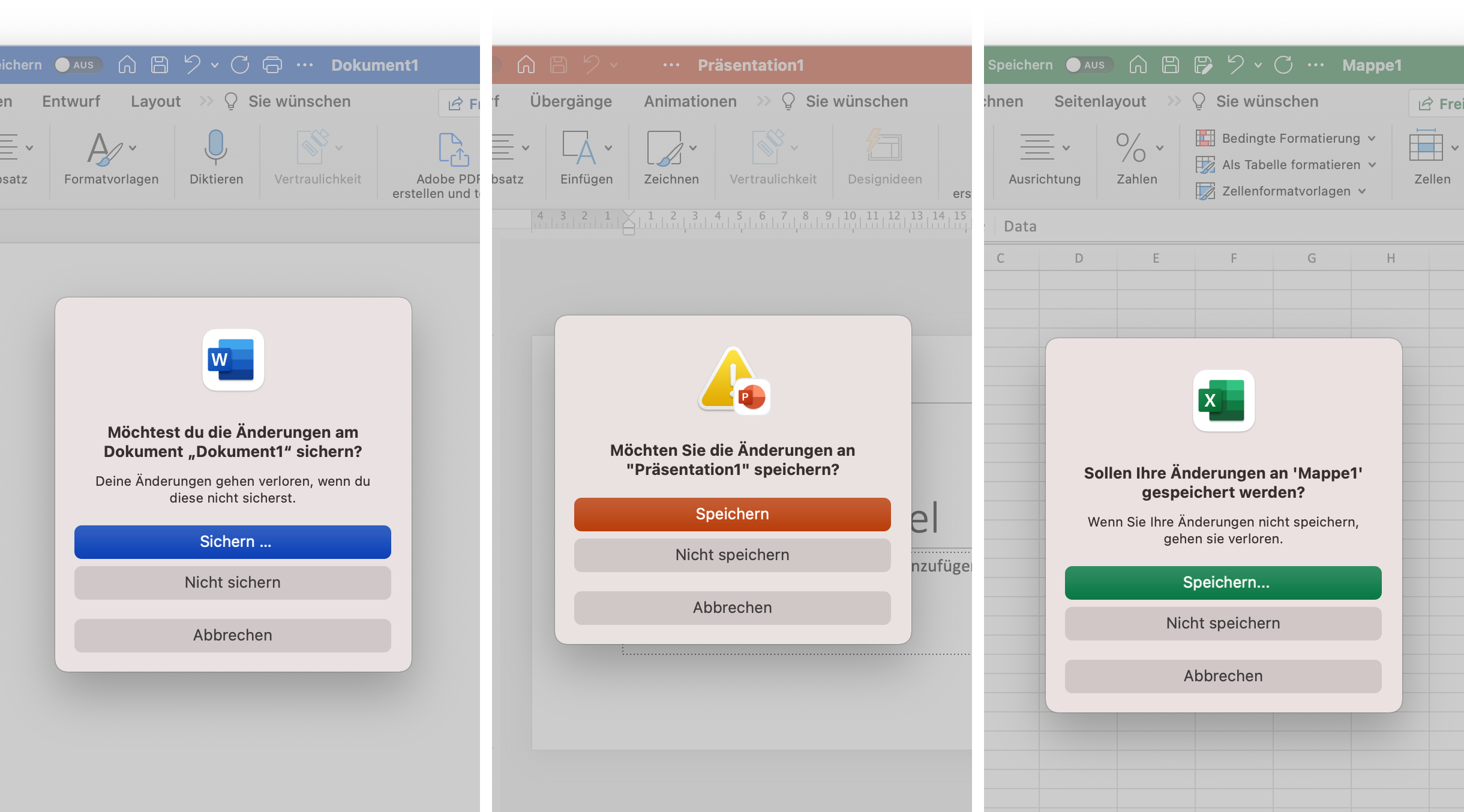
At first glance, not bad at all — but Microsoft doesn’t harmonize its dialogs either.
There’s a color system, and the basic dialog is at least the same, even if it strikes me as odd that it isn’t a single window (one you could select individually for a screenshot). Photoshop handles this differently. But:
- “Sichern …” (with a space) vs. “Speichern” vs. “Speichern…” (without a space) on the button,
- “Möchtest du …” vs. “Möchten Sie …” vs. “Sollen Ihre Änderungen …” as the text,
- warning icon vs. app icon, extra text or no extra text.
I wonder what other identical features the product teams are still implementing independently of one another.
Are big design systems impossible?
Why do things like this slip through at such large companies? I assume it happens precisely because they’re so large. The product teams are surely enormous. Each team builds its own thing separately, and since cross-team quality assurance is expensive and the text in Save dialogs isn’t the most critical feature, it just gets left alone. On top of that, the programs have to run on Windows and Mac (and also iOS and iPadOS), each of which comes with its own guidelines. So they build their own interface, so that at least their own programs look the same. But that essentially always goes wrong, as you can clearly see. With Adobe, this still happens in many places. The same command is called (in the German version) “Farbfelder importieren …” in Photoshop, “Farbfeldbibliothek Öffnen…” in Illustrator, and “Farbfelder laden …” in InDesign.
Still — Adobe, you’re the very emblem of design (or at least you want to be). I expect more.
Adobe’s save dialogues through the years:
- Adobe Reinvents The Wheel—time and Time again
- Babylon Adobe 2013
- Babylon Adobe 2017
- Babylon Adobe 2021