This article from 2011 is the first out of four that I wrote on this topic over ten years. For the other three, see the links below.
The same dialogue box from five different Adobe apps. Can you find all differences?
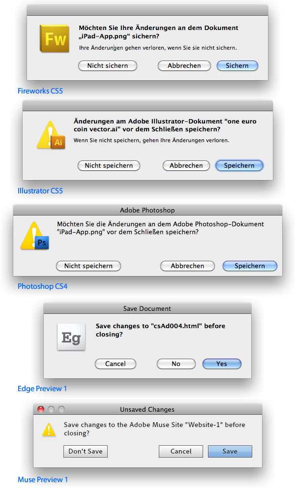
- None of them is a “sheet” as mandated by Apple, so they are not attached to the document window.
- All have different sizes
- Sometimes the text is left-aligned with the buttons, sometimes not
- Oh boy, the spacings of the elements
- Two dialogues have no window title (both CS5-apps), three have one. Two of those are from preview apps (so brand new). But all differ (“Adobe Photoshop”, “Save Document”, “Save Changes”)
- Muse app’s dialogue (the only Air-app) has the “traffic lights” in the title bar with the red “close”-button as the only active option
- The icons are big or small. They are either only the app icon, or the warning sign, or both. They aren’t even the same with the two CS5-apps
- In the German version both “Speichern” or “Sichern” are used, This too is different in the CS5-apps
- Edge’s buttons are not only named “No” and “Yes”, it also puts the destructive choice close to the safe one
- Muse paints its own buttons
- Text is bold or regular, but at least that is the same in the CS5-apps
- On the other hand, the text is phrased differently in those two apps
Apparantly, Adobe invents even a standard dialogue with every app anew. What’s bad is not only that they differ at all, but the amount of work that is put into this every damn time.
Adobe’s save dialogues through the years:
- Adobe Reinvents The Wheel—time and Time again
- Babylon Adobe 2013
- Babylon Adobe 2017
- Babylon Adobe 2021