Sometimes I miss slides. No, not the ones in PowerPoint. I miss real picture slides, the ones I used to take with my big analogue film SLR. Every time the pictures came back from the lab I was eager to browse through the slides to choose the keepers—on a small light table, where you could shuffle them around, group and compare them, see which ones had technical flaws, which ones fit together to tell a story and which ones captured the moment exactly right.
Today, digital technology has made everything faster, easier, cheaper. You don’t have to wait for your pictures to come out of the lab. Today, it is easy to browse through thousands of images in your digital photo library. You can delete bad pictures right away on the camera (or phone). You organise your pictures in virtual albums, in moments or stories, now even assisted by artificial intelligence that miraculously finds and presents your best shots. And that’s great. I love the photos widget on my iPhone.
But I never found a tool that helped me organise lots of photos into a story with the same freedom and overview that the analogue light table gave me for slides.
Choosing 300 pictures out of 30,000
For my daughter’s eighteenth birthday, we wanted to give her a photo album. No problem we thought: We have thousands of pictures of her, almost all of them already in our digital library, already collected in the automagically created folder with her name. It should be straightforward to make a photo album out of them.
But having the photos available digitally is only the start. Having so many of them is actually more a problem. What pictures are there? Which ones do we want to use? What is a good number of photos to illustrate the story of her life? Which ones belong or fit together, not just chronologically, but by theme? What order should we put them in?
There’s an app for that, isn’t there? Photo album software promises to assist with exactly that task. But not for me: The apps I tried concentrated too much on the actual layout of the spreads—and not on the creative phase that comes before the layout.
Moreover, looking at several digitally created photo book options, we decided that we liked the appearance of actual printed photos on actual paper pages better than any of those—despite the fact that digital photo books offer boundless creative freedom. But maybe that was the problem: Too many options, requiring too many design decisions. For us, it was printed photos, on real photo paper.
So we had to decide what files to send to the lab.
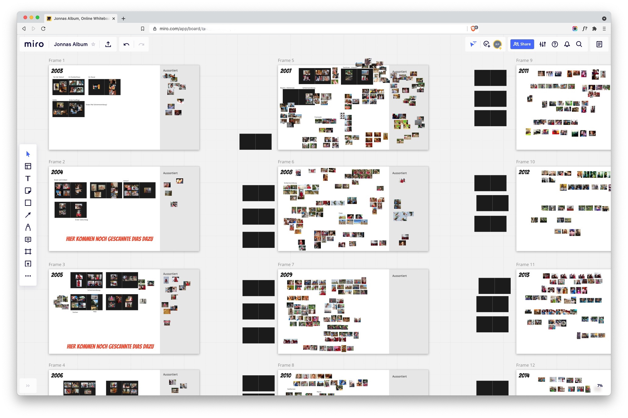
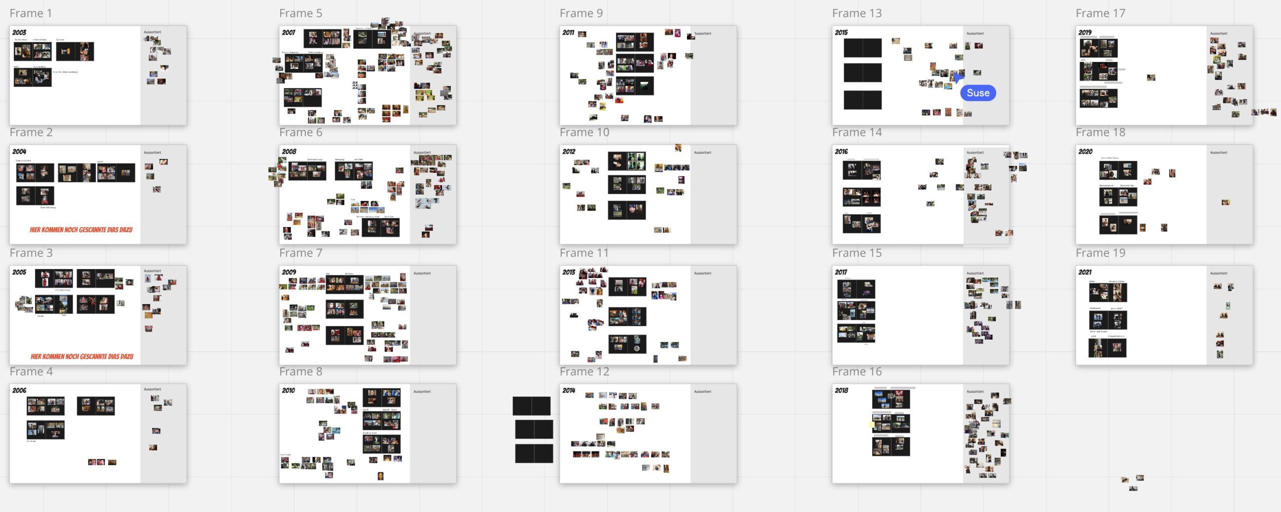
At the time we planned to make the album, there were about 40,000 pictures in my constantly growing photo library, give or take. Apple photos recognised my daughter in about 2,000 of them. In a quick triage, we cut that number down to about a thousand photos.
To simplify things, we settled on using just one format of printed photos. We figured that we could place about 300 photos, each 10 x 15 cm in size, on the pages of the album we had found.
Out of roughly a thousand pictures that we had selected from our photo library.
Now, what I wanted was the same general workflow as with slides on a light table, but without the constraints of the physical world. Because what light table can hold a thousand photos and can be kept in order, and secret, while working on it for several days in the same house our daughter lives in?
What about design software?
Could I use any of my design apps? Shouldn’t InDesign, Adobe XD, Affinity Publisher or Designer be perfectly up to the task?
I tried Publisher, but I did not want to think in pages yet. I wanted to triage, sort and group big numbers of images—spatially, but not by working on a layout. The linear setup of pages and the confined canvas did not work for me.
Adobe XD as well as Illustrator and Affinity Designer have artboards and big canvases. But only in XD can you share a document and work with others in real time—great, because my wife and I wanted to do just that. But you need the App and an Adobe Account, which my wife would rather not have to set up. What about Figma? It’s collaborative and provides all the tools, but we decided that it has a learning curve that is just a bit too steep for a non-designer.
In comes Miro
Miro is a collaborative online whiteboard, with all the tools you need to facilitate workshops remotely. Think Post-Its in a web app. It features some basic drawing capabilities, as well as the ability to place images. Its strengths are real-time-collaboration and a shallow learning curve.
I already liked Miro from my office work, so I decided to give it a try.
And it worked like a charm.
How could I make Miro handle 900 images in one document? I feared that full-resolution versions would slow the app to a halt—even uploading that amount of data would take too much time. But full-res photos weren’t needed—they just had to be good enough to recognise their content. So in the Photos app I set up several intelligent albums that held a year’s photos and exported small versions of them (about 20 KB each) that I then, year by year, dropped them onto artboards (called “frames” there) in Miro.
The little things
When you drop 40 images in Affinity Designer or Illustrator, they are all stacked on top of each other and you have to pry them apart to see them. Click and drag forty times. InDesign wants you to click forty times to place every image individually. Imagine doing that a thousand times.
Miro tidily places all the images in a grid so you can work with them right away. Like it should be. (XD does the same. Did I mention that this is one Adobe app that I like?)
After that, it is just dragging pictures around, and panning and zooming to navigate the canvas. And Miro is excellent at that. You would think that the established apps would have mastered these really basic and common tasks, but they pale in comparison to Miro.
Both panning and zooming are butter smooth in Miro and really quick with a touchpad or a mouse with a scroll wheel. Yes, I do know the keyboard shortcuts and modifier keys in all the other apps (I am a professional designer, for Christ’s sake), but the only other app that comes close in this regard is Figma, another web-based collaborative tool.
Even selecting images works better in Miro than in other apps. If you drag the cursor over objects to select more than one, you don’t need to care too much about exact positioning. Miro also selects objects that are only mostly covered by the selection rectangle. If it touches the object only slightly, it does not select it. I found it almost scary how the app seemed to know what I wanted to grab.
In the frames, I placed black rectangles of about the right size that represented the album’s pages, on which we roughly positioned the pictures. Pixel-perfect precision was not required, it would even have hindered us. It was more important to determine the rhythm of the content—the layout only had to be good enough.
With the pages filled in Miro, we could now order only the prints we needed. And we had a layout template for placing the printed photos in the actual pages of the album. Still tedious work, but easy and only time-consuming.
You cannot scribble in digital?
You can’t scribble in digital, says digital artist and designer Brendan Dawes. Which I find mostly true: I still have to find the digital tool that is as versatile, as quick, as cheap and as easily easy to navigate as a pen and a sketchbook. Or, for sorting photos, a light table. But Miro came very close to that freedom. For this task, anyway.
I only hope that with the pace at which new features are added to Miro, the development team keeps this in mind: It works, because it does not put a barrier between you and your thought.
Schreibe einen Kommentar